One of the most exciting things about this cottage is that it has a great skeleton. And that’s it. The rest is up to us. The previous owners left us some decent furniture but nothing on the walls except broken coat hooks, brown and gold decorative plates on the wall and a Bob Ross-esque painting, all of which are going to find a new home, most likely at Value Village.
Being able to decorate from scratch is a dream come true. It’s the opportunity to make our space into exactly what we want it to be right from Day 1.
Because it’s a cabin and surrounded by trees and nature, I want the outdoor world to be reflected inside. I want to use natural materials and make everything look a little old and worn and loved. I decided that with the warm golden yellow of the wooden walls, floor and ceiling of the main room, I would stick with one colour: traditional red. First of all, it’s a colour that pops off of the natural tones but is not garish. It’s a colour that is used often in old-world art and décor: in plaids and ginghams, in folk paintings, in pottery, and can be brought in from outside in plants and flowers. The rest of the colours used would be natural or neutral tones – cream, beige, fawn, or natural. My plan is that if I stick to one colour, then nothing has to match. But everything will go.
My first project was art. While you might think that art for the walls is certainly not a priority compared to, say, curtains or a new, clean slipcover for the sofa that is an unknown number of years old. However, it was the easiest thing to start with because it didn’t need to be fitted or measured.
 I found canvases at Jysk in a variety of sizes and at an exceptionally good price. They are, of course, cheaper quality than you would find at an art store but they were certainly good enough for the cottage. I bought three 16” x 16” canvases for $6 each to do a series of three folk paintings. I bought the bottles of craft paint at Dollarama – a bottle of Spun Gold, a bottle of Antique White and a bottle of Deep Red for $1 each. I had brushes already in my stash of craft and art supplies. The only art supply I had to spend any significant amount of money on was the crackle varnish that I bought at Michael’s for $12. Total? $33.
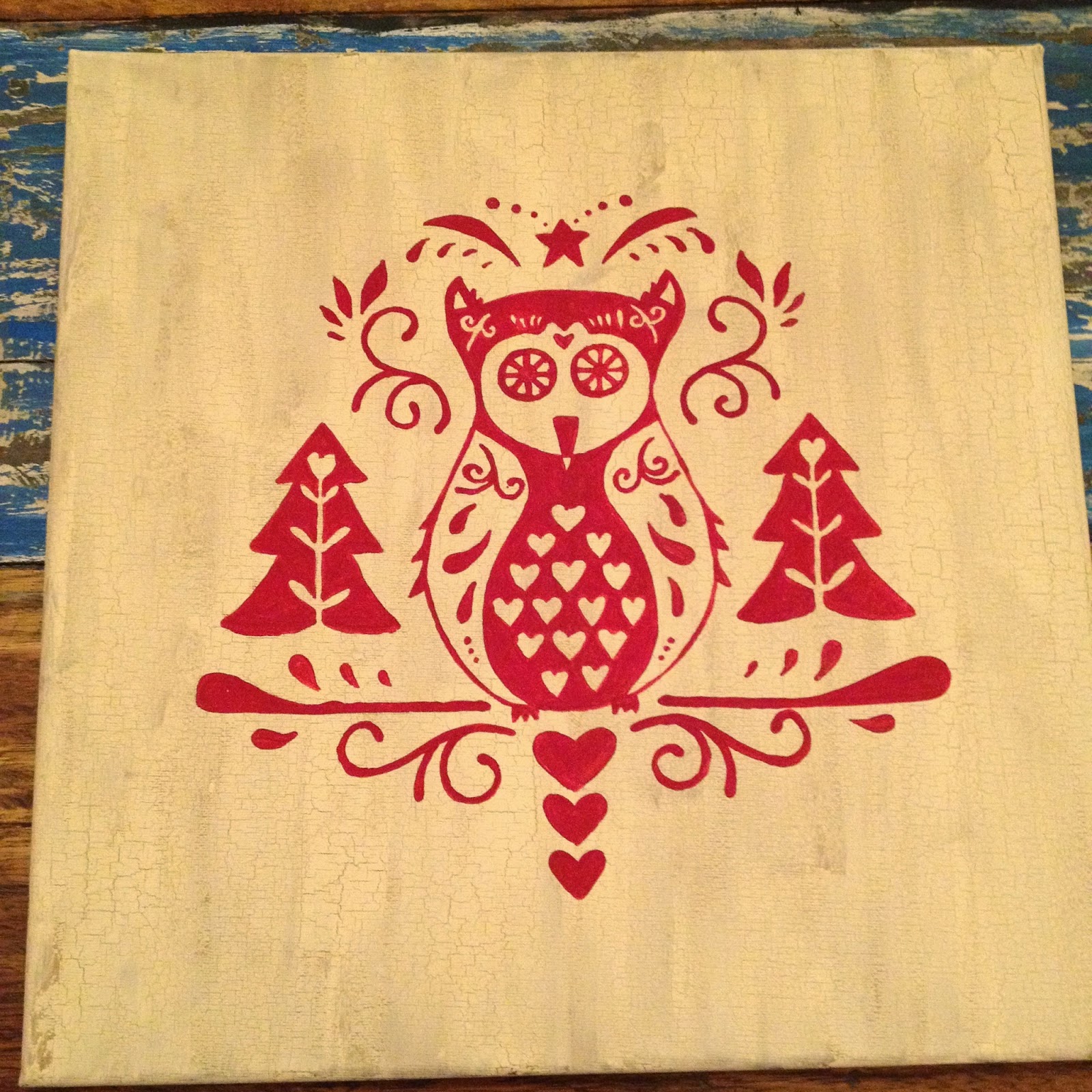
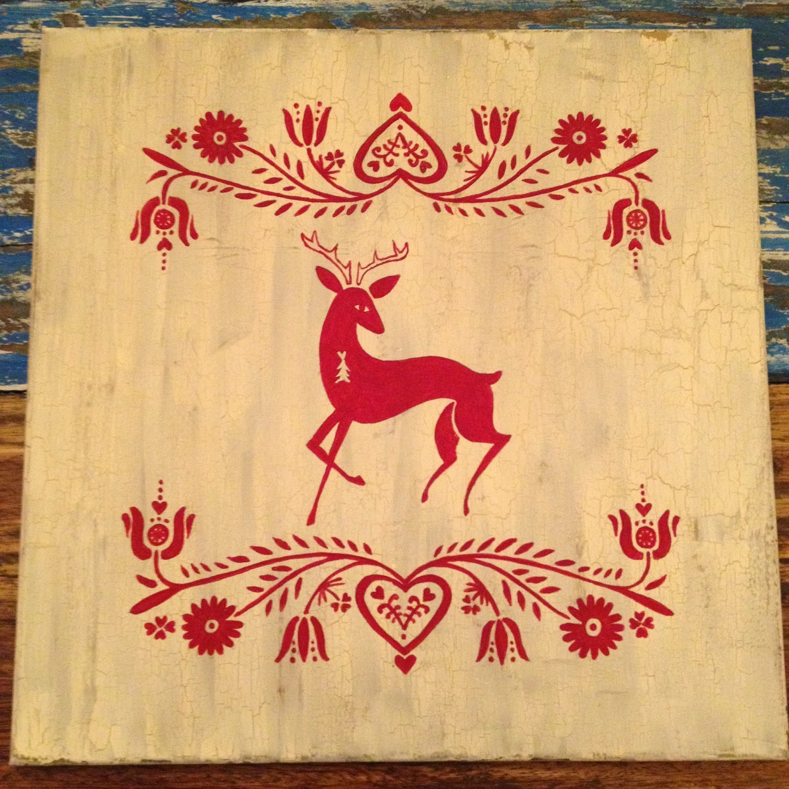
I wanted these three pieces to look old. Not just old in age but also in design. So I bopped around Pinterest and found some folk art inspiration. I will whole-heartedly admit that these are not my own original designs. I thought of three animals that actually live in the woods near the cottage (deer, fox and owl) and searched for folk art containing them. I found three I enjoyed and then modified the composition using similar motifs in all three so that they all had the same mood and whimsy and would look cohesive together.
The first thing I did was to prepare the canvases. I knew that I wanted it to look old so I opted to use crackle varnish. I had originally intended to put crackle varnish over the finished paintings but after one failed attempt, I learned that crackle varnish only crackles if it is between two thick coats of paint. So I had to redo that canvas completely.

I decided on painting the bottom layer the Spun Gold colour. It was a natural brownish gold tone that had a light shimmer to it. I did two coats of it so that it was starting to look opaque. I was going to put the crackle layer over it and I liked the idea of something slightly shiny and rich peeking out from between the cracks of the top coat. Then I put the crackle layer on.
Let me tell you about crackle varnish. It took me several tries to get it to work properly. I used it on one of the first canvases I painted on and soon realized that I had not used enough paint as a topcoat and had to repaint the ensuing mess entirely. Crackle varnish has to go on thick. And you have to be fast when applying it because it’s acrylic and it dries within minutes. You also want to make sure that you keep your brush strokes going the same way with the crackle varnish as well as the top coat. This will end up giving it a cracked wood look. Let the crackle varnish dry. My canvases took a couple of hours to dry enough to put the top coat on. When I did the sample size on a small canvas board, it was a fraction of the time. The crackle varnish is ready when it’s slightly glossy but not shiny and it doesn’t feel tacky.
Then I applied the top coat. The top coat also has to be applied thickly and quickly. Concentrate on getting it right the first time because the crackling starts almost immediately. If the topcoat is too thin, it doesn’t crackle and you will need to re-do everything. You can’t just simply put more paint on. If you put wet paint over a section that has already started to dry, the already-drying top coat of paint will simply peel off with your brush. Allow this top coat to dry. I did three canvases and the look of the crackling is different on all three. I must have had varying thicknesses and amounts because the owl has very even crackling, the fox has sporadic crackling and the deer has large sections of significant crackling. I think this just adds to the rustic charm of them. None of the designs is the same so it suits them that the crackling is also different on all three.
 |
| You can see in the corner, what happens if you brush over a part that has started drying. Luckily, in this case, it adds to the charm. |
Then I started working on the subjects. I love symmetry. And I loved how symmetrical these three designs were. But painting symmetrical things is extremely difficult because, well, it has to be exactly the same on both sides. Perhaps some people are gifted enough to pull it off free-hand. I, however, am not.
First I bought three sheets of bristol board and drew a grid on them with 1″ squares. Then I used the grid to make sure the drawing was symmetrical. When drawing on bristol board, don’t draw on the shiny side. It’s almost impossible to erase anything off of the shiny side and the eraser marks become highly distracting.
When I was happy with the drawing, I cut the bristol board into a stencil using an Exacto knife. I only cut out half the picture though because I wanted both sides to be exactly the same. Two of my paintings actually have two lines of symmetry so I only cut out a quarter of the design in order to simply rotate the same stencil around the canvas. I was not going to be drawing a grid on the painted canvas so I needed to ensure that the design could be painted symmetrically.
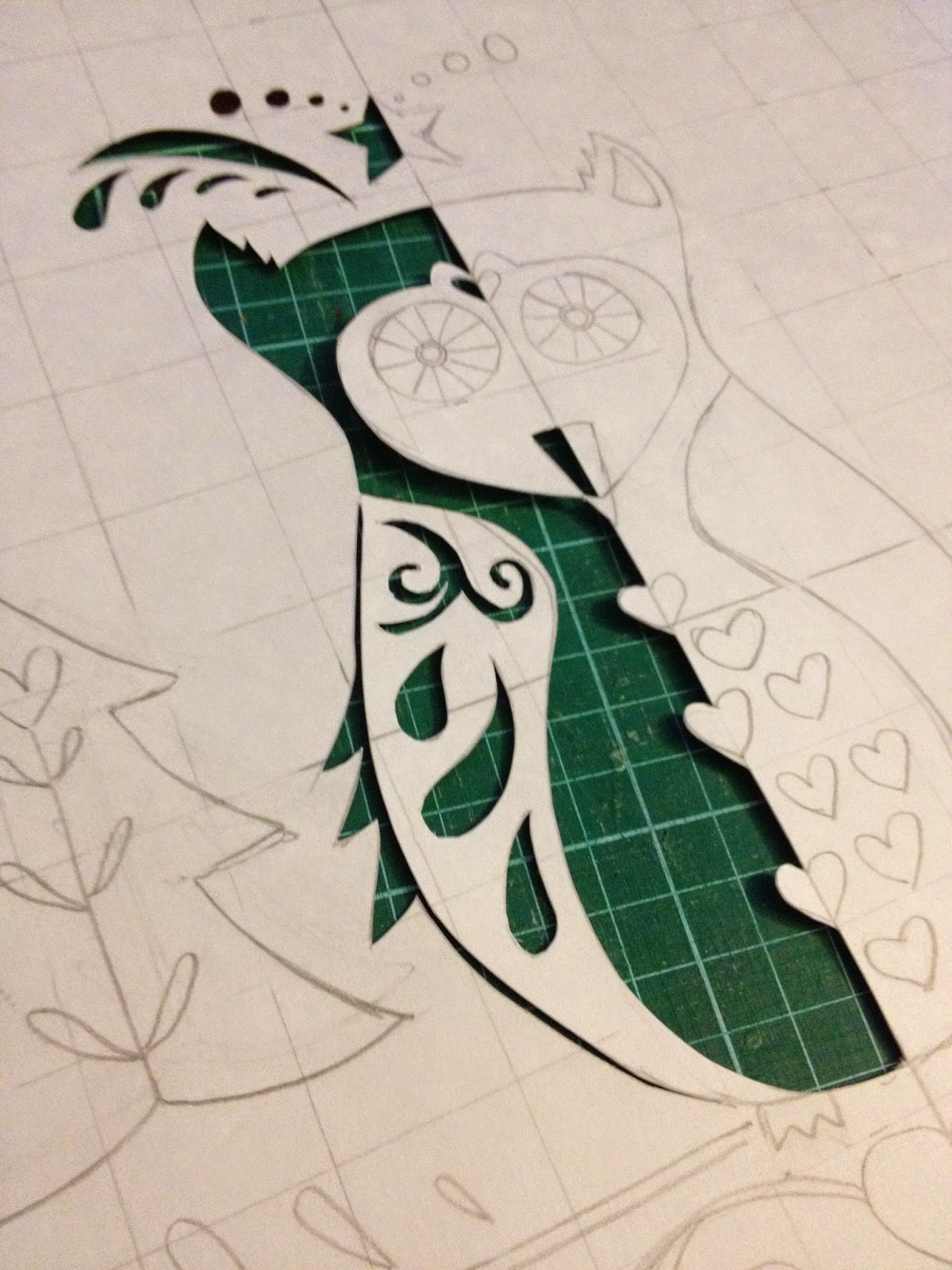 |
| I only cut out half of the owl since this painting is perfectly symmetrical. |
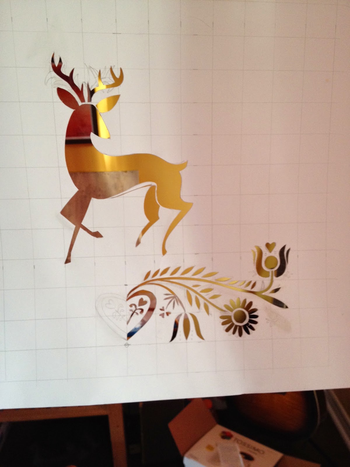 |
| I cut out only this half of the design because I can rotate and flip it to get a full design on the bottom as well as across the top. |
On the first canvas (the one I eventually had to do over because the crackling didn’t work), I just painted over the stencil, as you would normally with a stencil. Unfortunately, the paint bled under the bristol board and it ended up having a messy look to it so it wasn’t a bad thing that I eventually had to do it over. After that, I simply took my pencil and drew light lines in the stencil where I should paint. After removing the stencil, I painted over the lines.
 |
| You can see the light pencil lines that I painted over. |
The style of painting was very similar to toll painting and as I painted, I became more comfortable using the shape of the brush and different pressure to change the shape of the strokes and lines I was painting. I painted two coats of the red because as you can see above, the red was a translucent colour and brush strokes were visible with only one coat. (A note about painting over the dried topcoat after crackling. With the first coat of red, the paint continued to crackle in places, which added to the look of age but because I needed to add a second coat to create a more opaque red, it did not crackle again.)

 |
| These photos are a fairly close representation of the colours. |
I don’t have an incredibly steady hand so if you look too closely, you will see lots of imperfect lines. But I’m very happy with the way they turned out, they way they look together and with the way they look on the wall in our cottage. I would definitely say this project was a success!


Very delicate work! Can wait to see your next art project.
LikeLike